


Color Muse
4.2129.00 Reviews
App Specs
- Version
- Varies with Device
- Updated On
- License
- Free
- Downloads
- 50,000+
- Developer
- Variable, Inc
- Categories
- House & Home
- Platform
- Android
Screenshots
 Analysis by AppCompare
If you're someone who loves to indulge in home improvement projects or if you're a designer with a keen eye for color, then you might want to check out the Color Muse app. This nifty tool claims to be your personal color assistant, and I was curious to see if it lived up to the hype. So, I took it for a spin, and here's what I found.
Start with a real object, not a paint chip
The most useful way to approach this app is to begin with something you already want to match: a curtain, a tile, a cushion, or a painted wall. Because it works with the Color Muse tool, it is not simply another camera filter that estimates a shade from a picture. That distinction matters if you are trying to take a color from an object and find a related product. I would treat the scan as a way to narrow the search, then check the physical product before committing to a large purchase.
That workflow suits small, practical decisions especially well. If I were refreshing a room, I could bring a fabric sample to the item I want to coordinate, scan it, and use the resulting match to explore paint choices. For a renter choosing accessories rather than repainting, the same process can help compare cushions, storage, or decor against an existing wall. The value is less about picking a perfect color in isolation and more about turning a visual starting point into a shortlist that is easier to discuss and verify.
What to prepare before scanning
Color can look different under warm indoor bulbs, cool daylight, and shade, so I would avoid making a final choice from a single scan taken wherever I happen to be standing. A practical tip is to check the object in the light where it will be used, then repeat the comparison in another setting if the result will guide a permanent change. This does not make the reading infallible, but it helps reveal whether the apparent match depends on the lighting rather than the material itself.
Small or glossy objects need extra care. Reflections, shadows, texture, and nearby colors can all affect what the eye perceives, so a shiny tile or patterned cloth is a less straightforward target than a flat, evenly lit surface. I would scan a few representative areas rather than trusting a single spot, especially when the sample has visible variation. If several readings point toward a similar family, that is a more useful signal than chasing one exact result.
For an actual paint decision, I would use the app to identify candidates, not to skip sample testing. A color on a phone display is not the same experience as a painted wall: room size, daylight, finishes, and neighboring colors change the impression. The sensible handoff is from scan to product shortlist, then from shortlist to a physical sample on the wall. That extra step takes time, but it is far cheaper than repainting an entire room because a digital match looked different at home.
First Impressions
Downloading and setting up the app was straightforward. It’s available on both Android and iOS platforms, so no worries there. Once installed, the app presents a clean, intuitive interface. The home screen is uncluttered, which is a big plus for me. No one likes to wade through a sea of icons and options just to get started.
Worth Reading Before You Choose

EA SPORTS FC Mobile 26 Is a Bigger Football Game, but It Takes Time

Flipboard Shows What News Apps Must Do Beyond the Feed

Switching to Android Auto Means Rethinking Your Driving Routine

Google Calendar Makes a Crowded Week Easier to Manage

Ludo King Makes the Most of the Minutes Between Plans

Baby Panda World Brings Quick Play to Modern Phones, but Its Game Library Feels Busy
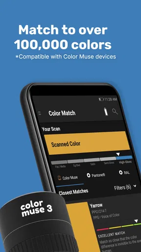
Immediately, I noticed a prominent feature: the ability to scan and identify colors using your smartphone’s camera. The app promises accurate color matching, which is a godsend for anyone who has spent hours in a store trying to find the perfect shade.
How Does It Work?
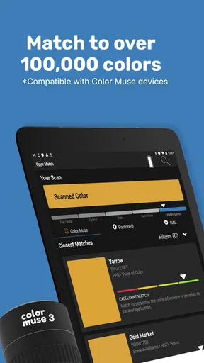
The core feature is its color identification tool. You point your phone’s camera at a real-world object, and the app provides you with the closest color match from major paint brands. It’s like having a pocket-sized color consultant!
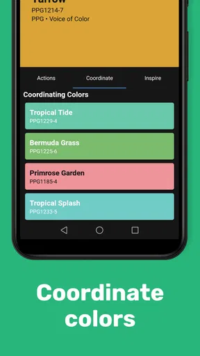
During my tests, I tried scanning a variety of objects, from a bright red apple to a subtle beige cushion. The app performed admirably, providing accurate matches and even suggesting complementary colors. It’s not just about finding a match; it’s about creating a harmonious palette.
Exploring the Features
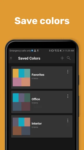
Apart from color matching, the app offers a host of features that can be a game-changer for designers and DIY enthusiasts. You can save your favorite colors and create custom palettes, which is super handy when planning a room makeover or a new project.
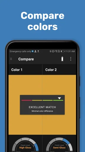
Another useful feature is the app's ability to compare colors side by side. This is perfect for those moments when you’re torn between two shades of blue and need a little help deciding. Plus, the app provides detailed color information, including RGB and hex codes, which is invaluable for digital designers.
Make the scan useful to someone else
A color decision often has to move between people: one person finds the inspiration, another buys the paint, and someone else approves the final look. Saved colors and palettes give that conversation a shared reference instead of relying on descriptions like “the warmer blue” or a phone photo that shifts from screen to screen. I would name a palette by room or project and keep the candidates together, so a later comparison does not become a hunt through unrelated ideas.
For a designer, a palette can also be a useful bridge between a physical reference and digital work. RGB and hex values help when carrying a color into a screen-based mock-up, while the matched product can keep the conversation grounded in something that may be available to buy. Those values should not be mistaken for a guarantee that a monitor and a painted surface will look identical; they are practical identifiers, not a substitute for checking the material in context.
When handing a choice to a contractor or shop employee, I would share the product name and the physical reference where possible, not just a screenshot. A scan result can make the search more focused, but a supplier may carry different ranges, and a color name alone can be interpreted differently across product lines. This is where a tool like this helps with preparation rather than replacing the person who knows the stock and finish options.
Real-World Applications
So, how does the app fare in real-world scenarios? Pretty darn well, I’d say. Whether you're picking out paint for a new nursery or trying to match fabric for custom drapes, it’s a reliable companion. Its extensive library of paint colors from major brands ensures you have a plethora of options.
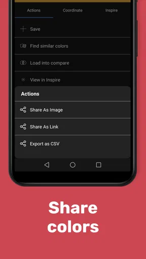
The app also facilitates easy sharing of color palettes, so collaborating with clients or friends becomes seamless. You can export your palettes and email them directly from the app, which is a neat touch for professionals who need to share ideas quickly.
Where it fits—and where it doesn’t
Compared with browsing paint fan decks or searching a retailer’s catalog, the main advantage here is the starting point: you can begin with an object already in your home instead of trying to describe its color from memory. Compared with a general phone camera or a screen-based color picker, the dedicated Color Muse tool gives the process a more deliberate route from a real surface to a product match. But if I only needed a quick visual impression, a photo and a basic palette app might be enough; buying or using the matching tool is less compelling for a one-off curiosity.
The app is a natural fit for people who make color decisions repeatedly: decorators, DIY regulars, makers, and anyone coordinating several finishes in one room. It can also help someone who struggles to compare shades by eye, because it turns an open-ended search into a more concrete set of candidates. On the other hand, a person who wants a complete room-planning system, furniture placement, or a broad renovation checklist should look elsewhere. This is focused on color matching and related choices, not the whole home project.
One everyday example: I might be replacing a scuffed hallway paint section and want the repair to blend with the existing wall. I would scan an intact area in even light, compare the suggested product options, and take the leading candidate to a paint counter. Then I would test a small sample on the wall and check it after it dries under the hallway’s usual lighting. If the repaired area is old or faded, the closest original color may not match the wall as it looks today; scanning a nearby section that has aged the same way is the more useful comparison.
For textiles and decor, the workflow is a little different. A patterned cushion may contain several plausible colors, so I would choose the particular detail I want to echo rather than treating the whole object as one shade. If I am matching a curtain to a rug, I would also consider whether I want an exact match or a complementary contrast. The app can help identify candidates, but the design decision still depends on how much visual contrast feels right in the room.
What Could Be Better?
No app is perfect, and it is no exception. While the color matching is generally spot-on, the accuracy can sometimes vary depending on lighting conditions. It’s best to use it in natural light for optimal results.
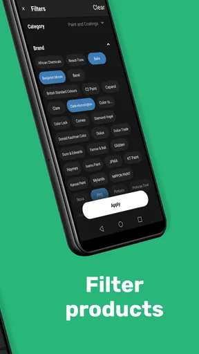
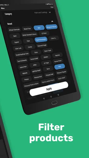
Additionally, while the app supports a wide range of paint brands, it could be even better with more international options. For users outside the US, the selection might feel a bit limited.
There is also a practical distinction between identifying a color and obtaining the exact product you need. A match is most helpful when the relevant brand and product range are available where you shop; otherwise, it becomes a reference for looking for a close alternative rather than a direct purchase route. I would check availability before building a project around one specific match, especially if timing or a particular finish matters.
The app is free to download, but it works with the Color Muse tool, so the full workflow is not simply a matter of installing software and pointing an ordinary phone at a wall. In-app purchases range from $4.99 to $99.99 per item, which makes it worth checking the purchase options and deciding how often you will use the setup before spending. For someone matching colors regularly, that cost may be easier to justify than for a person who only wants to identify one shade once.
It is a House & Home app from Variable, Inc, and it has a 4.3 average from 447 ratings, with 50K+ installs. Its Everyone age rating makes it broadly suitable, while its release date of April 6, 2015, and minimum OS requirement of 7.0 offer useful context for people checking device compatibility. The numbers suggest an established niche tool rather than a universal home-design platform, which matches my view of its best use: focused color work.
Final Thoughts
Overall, the app is a fantastic tool for anyone who lives and breathes color. It’s user-friendly, feature-rich, and pretty reliable when it comes to color matching. Whether you’re a seasoned designer or just someone who enjoys a bit of DIY, it’s worth having in your toolkit.
So, if you’re in the market for a color assistant that fits in your pocket, give it a try. It's free to download, and who knows, it might just become your new favorite app!
My recommendation comes with one condition: treat a scan as the beginning of a decision, not the final authority. Use it to turn a real object into a manageable set of product possibilities, then check the leading option against the surface, lighting, and availability that matter to your project. That balanced approach is where I think this tool earns its place. If you only need to browse inspiration, a simpler option will do; if you regularly have to translate real-world colors into products, this focused workflow is much more useful.
Pros
- Accurate color matching for various materials.
- User-friendly interface with intuitive navigation.
- Large database of colors and brands.
- Saves color history for easy reference.
- Compatible with both Android and iOS devices.
Cons
- Requires a stable internet connection.
- Limited free features; subscription needed.
- Occasional bugs in color detection.
- Device-specific compatibility issues.
- Battery-intensive during prolonged use.
FAQs for Color Muse
What is Color Muse and how does it work?
Color Muse is a powerful app designed to identify and match colors from real-world objects using your smartphone camera. Simply scan an object, and the app provides you with color matches and detailed information, such as RGB and HEX codes, making it ideal for designers, artists, and DIY enthusiasts.
Is Color Muse compatible with all devices?
Color Muse is available for both Android and iOS platforms, ensuring a wide range of device compatibility. However, it is essential to check the app's requirements in the Google Play Store or Apple App Store to ensure your device meets the necessary specifications for optimal performance.
Does Color Muse require an internet connection to function?
While the basic color matching features of Color Muse can be used offline, an internet connection is recommended for accessing additional features such as saving color palettes, sharing results, and downloading updates. Online access also enhances the accuracy of the color library updates.
How accurate is the color matching feature of Color Muse?
Color Muse provides highly accurate color matching, but it is important to consider lighting conditions and camera quality, which can affect results. For best accuracy, ensure good lighting and a stable camera position. The app continuously updates its color library to improve precision over time.
Is there a cost associated with using Color Muse?
Color Muse offers a free version with basic features, but for advanced functionalities like expanded color libraries and professional tools, there may be in-app purchases or subscription options. It’s advisable to review the app's pricing details within the store before downloading.


